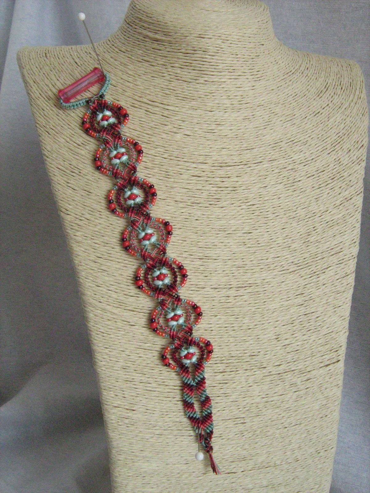
Lo riconoscete? Ma sì, è sempre lui: Anna Bracelet di Joan Babcock. Con un'altra palette, con una sequenza in più di nodi nel motivo centrale (comunque prevista dall'autrice) e soprattutto con altre perline tra cui le Superduo, che non erano ancora state messe in commercio all'epoca della pubblicazione del libro da cui è tratto il progetto. E il risultato è del tutto diverso, come potete vedere nella foto di confronto più in basso.
Do you recognise it? Oh yes, it's Joan Babcock's Anna Bracelet, reloaded. Another palette, one more knotting sequence in the central motif (in any case provided by the author herself) and, most of all, different beads among which the Superduos, which hadn't been invented yet at the time the book containing the project was published. And the result is utterly different, as you can see in the photo comparing the two bracelets.

Le puriste storceranno il naso facendomi notare che il lavoro è irregolare: lo so, è perché alcune delle perline lo sono, ma credo che ciò faccia parte dello spirito del braccialetto; preziosa e raffinata la prima versione, "caciarona" ed estiva questa seconda. Presumo che chi ha apprezzato il primo braccialetto, amerà di meno questo e viceversa.
Purists would raise an eyebrow noticing that the work is pretty irregular: I know, that's because some of the beads are, but I think that this is part of the overall style; the first bracelet was precious-looking and stylish, this one is lively and inspired by summertime. I suppose that those of you who particularly liked the first one, wouldn't like this one so much and viceversa.


Tutto sommato sono abbastanza soddisfatta anche se secondo me le Superduo avrebbero potuto essere valorizzate ancora di più, ma nonostante avessi disegnato uno schema prima di iniziare, il risultato è stato molto diverso dall'atteso. D'altra parte è solo facendo che si capisce che aspetto avrà il lavoro. Sembra banale ma non lo è. Io avevo pensato che le Superduo si sarebbero disposte con le punte verso il centro - creando quindi una specie di croce - e invece si sono disposte nel senso della lunghezza, creando una sorta di quadrato attorno alla perla rossa centrale.
After all, I'm happy enough with the result though I wish I had exploited the Superduos in a better way. The truth is that, although I had drawn a sketch before beginning to knot, the final result was very different from what I had expected. It sounds trivial to say that it's only by making things that you really see how the work will look, but it's not so. For example, I had thought that the Superduos would turn their points towards the centre, while exactly the opposite happened: instead of the expected "cross", I got a "square" framing the central red bead.

Aggiornamento/Update 08/05/2013: la palette è un'interpretazione di "Street Tones", sempre da Design Seeds / the palette is my version of "Street Tones", taken from Design Seeds: http://design-seeds.com/index.php/home/entry/street-tones


Bellissimi!!!!!! tra i 2 io preferisco quello nei toni del blu e beige..... l'avresti detto, ovviamente, vero? :-))
RispondiEliminaNoooooo, ma quando mai??? :-D mettiamola così, uno è stile Roberta, l'altro è stile Rossella! :-)
EliminaGrazie per la visita e per la ricerca dell'autrice del nostro ultimo post, piacere di conoscerti!!!! ho trovato nel tuo blog tantissimi progetti di buon gusto e fattura
RispondiEliminaora ti seguo
Grazie mille!!! Troppo buona, voi siete così brave...
RispondiEliminaMi piacciono entrambi!! Perfetti per l'estate!!! :-D
RispondiEliminaGrazie cara!
Elimina